Searching for “Web Designer Fort Worth?”
Snappetizers is a food brand located near “Cowtown” and sought a Fort Worth web designer to complete a project for a new product line. They didn’t have to look far. Having worked with Moon and Owl on two parent company projects, Vice President Lee Keller knew just who to call. We answered and the project was scoped, estimated and launched rapidly.
What are Snappetizers Toppers?
Snappetizers current product line includes four delicious flavors of toppers which can be used over cream cheese and as glazes. These include a raspberry chipotle, sweet pepper, candied jalapeno, and peach habanero toppers.

The product is used on cream cheese, appetizers, snacks, entrees, desserts and more.
Product Chief Value Proposition
Convenience – Single Use Packaging
The glaze toppers feature the convenience of single-use packaging. The user simply has to grab a single packet, open the lid, use the glaze, and then throw the packaging in the recycle bin. This is in stark contrast to traditional glaze bottles that customers buy. These typically sit after first use unattended in the refrigerator, sticky and spoiling.
Affordable
Whereas the bottle of glaze often costs $10+, a party serving of Snappetizers Toppers costs less than $1.
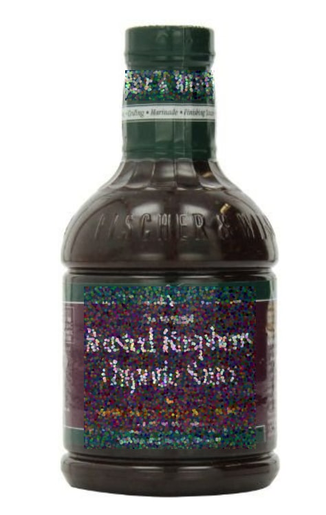
This well-known competitor costs $17 a bottle.
Copywriting and Marketing Message
Snappetizers had the company marketing tagline, “We Make Entertaining a Snap.”
We loved that tagline. It embodies the goal of the brand.
We worked on with them on the simple product specific tagline…
Peel. Pour. Enjoy.
This embodies the product’s CVP.
We reinforced this message with fun statements throughout the website like:
- Meet Your Rescue Party
- See how easy entertaining can be!
- Mr. OR Mrs. “Last Minute”, Meet Your Match.
- On your mark. Get set. Done!
After all, this is a party in a container.
Photo Shoot Direction
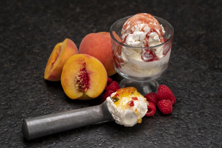
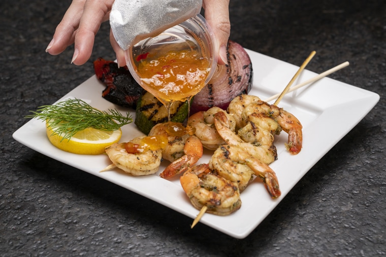
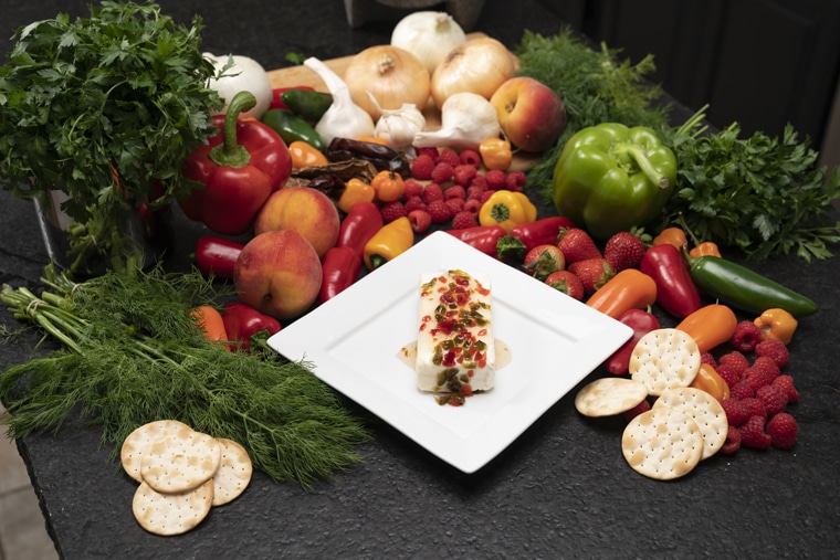
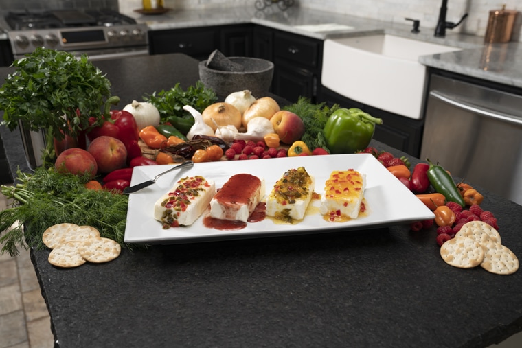
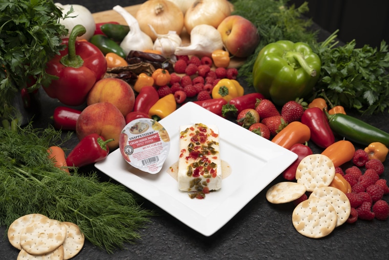
We knew we needed great photography of the product to make site visitors instantly hungry. We contacted Javier Herrera who did a great job capturing a diverse shot list.
We made sure the shot list captured each flavor on each type of food group:
- Appetizer
- Entrée
- Dessert
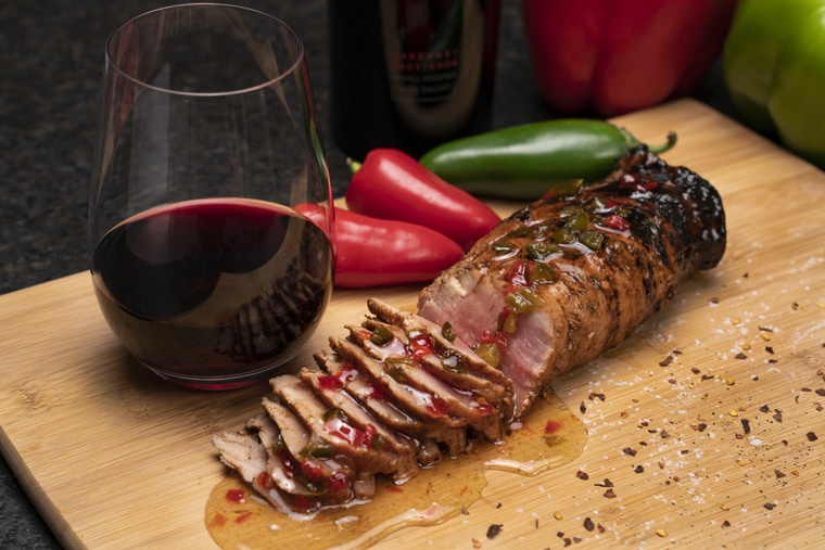
Here are some the great shots that Javier captured.
Video Shoot Direction
We knew we needed a video that showed exactly how easy the product is to use. We shot this short 15-second usage video to replicate Peel. Pour. Enjoy.
Homepage Wireframe
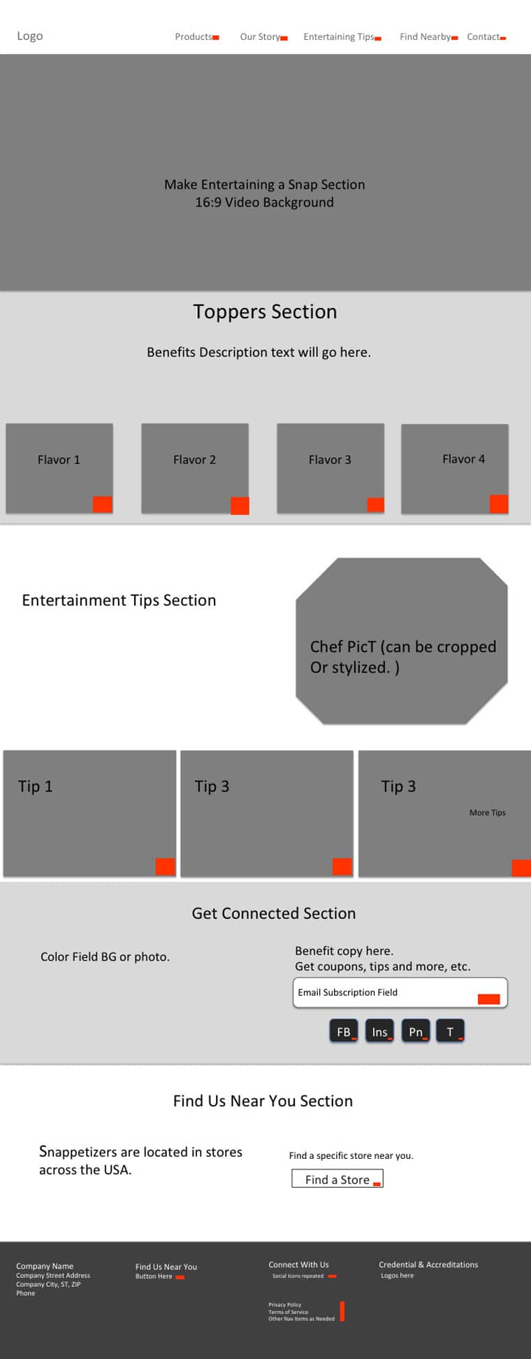
Hero Section
We had initially placed the video in the header as a backdrop, but upon further consideration, it was important enough to the experience that we didn’t want mobile users to miss out. You’ll see how it was repositioned on the actual site mockup to allow play on mobile.
Section 1: Product Packaging
We knew that the product packaging needed to occur high on the page to help customers identify Snappetizers Toppers so they could find it in the stores. The four individual products were placed immediately under the hero section.
Section 2: Product Use
The next major section features ways the products can be used. We didn’t want to get pigeonholed into a “we are cream cheese only” product. Showing how the product is used on diverse categories of food is vital to the customer’s understanding of project usage.
Section 3: Email Capture
An email subscription section was included to allow site visitors to sign up for tips to make entertaining a snap. In the future, a receive-manufacturer-coupons call to action will be added.
Section 4: Store Locator
This store locator section is initially in pause mode as at the time of launch the product was only available in Walmart. As the product expands into other grocers, this section will be populated.
Section 5: Footer
Solid UX includes important navigation features, social media icons and NAP (name, address, phone number) at the bottom of the page.
Design

The site needed to scream, “It’s a party.”
To accomplish this, we used a bright palette. One challenge was complimenting the established brand color of the Snappetizers logo along with the food shots that were to be incorporated. The design team worked to construct the palette which the client approved.
The font choice was informal to lend to the party vibe we desired to create.
We also avoided a lot of square lined boxes. Everywhere you look on the site there is a curved shape in the background, a rough-edged label, etc. Basically, we were going for the opposite of a white-collar-professional site (lawyer, doctor, etc.). Because even if you are a white-collar professional, you still want to unbutton your collar, let your hair down and have some fun.
Site Architecture and Content Access
The site architecture was kept simple.
The header navigation only has four options:
• Home
• Products
• About Us
• Blog
• As future grocers come onboard, a store locator navigation feature will be added.
The product page features a linear scroll of each flavor, presenting its product package, an in-use photo, nutritional information as well as a call to action button on tips for additional uses.

We wanted to make it easy for the client to add recipe ideas and tips on their own in 4 major areas of:
• Appetizers
• Entrees
• Desserts
• Entertaining Tips
At the same time, we knew we needed to be able to sort these posts by product type, so we used a tag system to demarcate which flavor was used in which recipe.
In this way, the callouts on the homepage for the four major areas fetch the appropriate category of the blog archive.
On the products page, each flavor fetches every recipe using that particular flavor regardless of which category in which it falls. We did this via a tags system.
Here is an example of the fetch system.
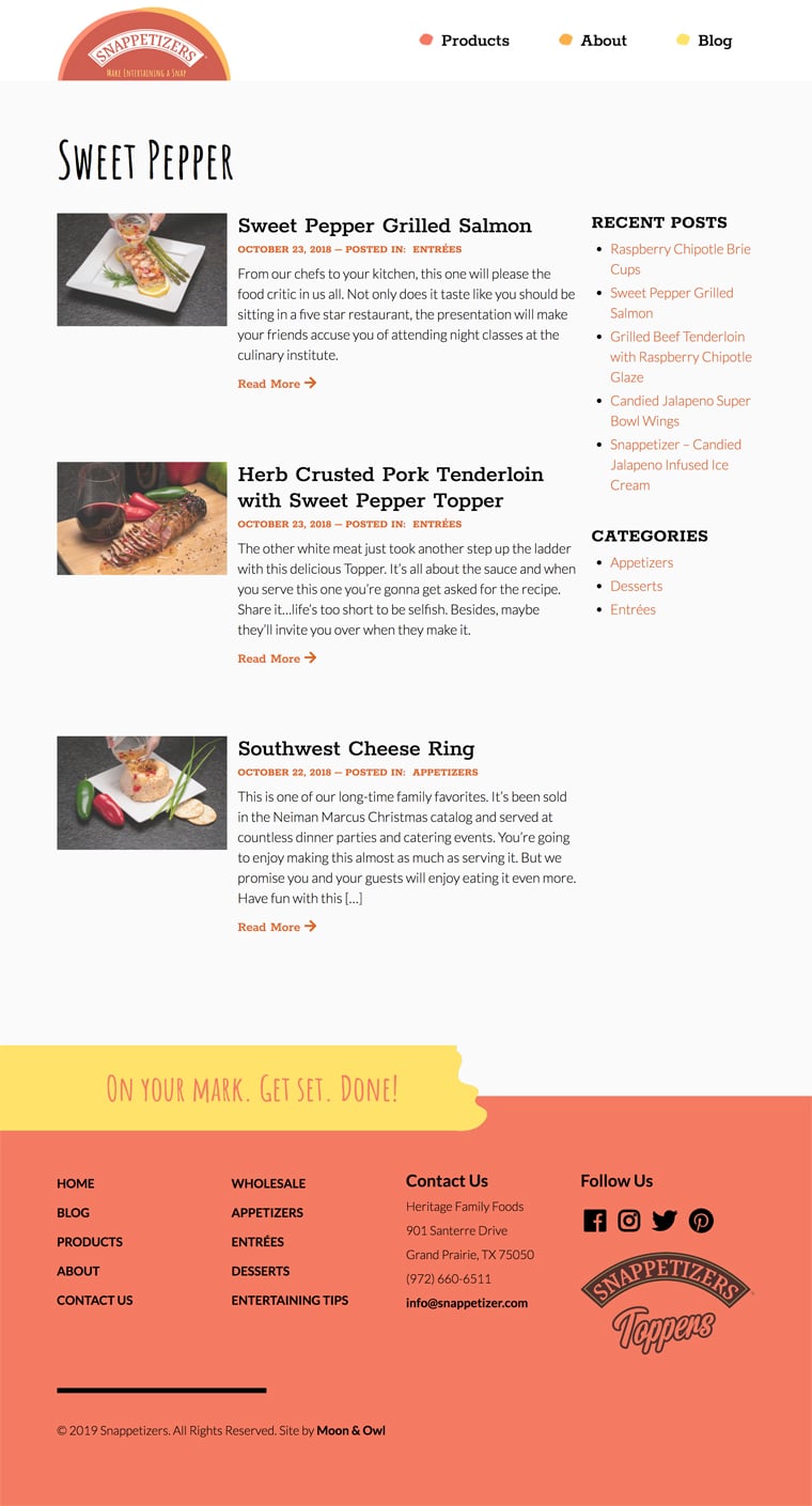
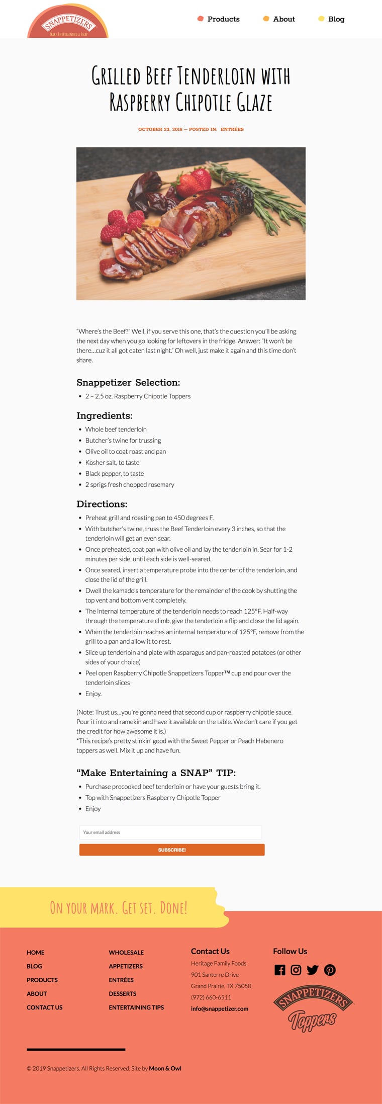
And here is how a recipe listing appears.
After the Snappetizer Fort Worth Web Design Completion
The site recently launched. Soon Moon and Owl will create paid social media campaigns to educate consumers on the existence of the product. The client loves their website. The site is already drawing inquiries from store reps. The grocers like that a brand is putting skin in the game to promote their products because this helps stores sell.
We are pleased to have another company in the Fort Worth area as satisfied web design clients. Thanks for the opportunity, Snappetizers.
Snappetizers: A Fort Worth Company’s Web Design Project is republished from: https://www.moonandowl.com/
No comments:
Post a Comment