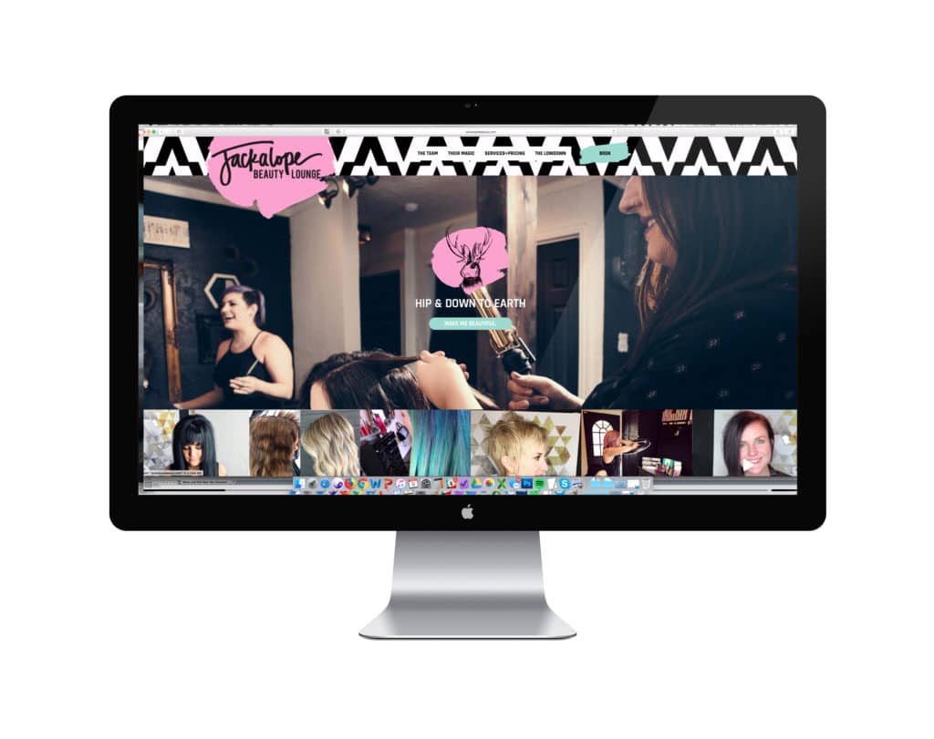
 Jackalope Beauty owners came to Moon and Owl to create a web experience for their users that reinforced their “We’re cool, but not pretentious” brand.
Unlike so many we-take-ourselves-so-seriously, highbrow salons with their cut-throat work environments, Jackalope has built something quite different:
…a place where you can get a top-shelf style and cut while being 100% yourself.
…a salon where the staff is well-taken care of (paid vacations and advanced training opportunities) so that they can take great care of the clientele. They know a happier stylist styles a better you.
…a salon that believes in developing the next generation of stylists by offering apprenticeships.
We were able to deliver a site that captures their brand essence.
SITE COPYWRITING
Reinforcing the Brand
Homepage Copywriting
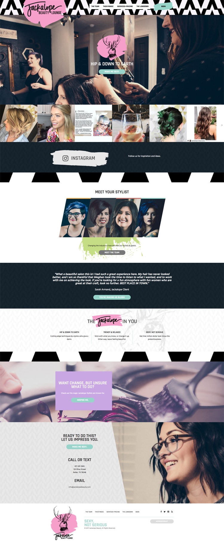
We used various statements on the homepage in the text to reinforce Jackalope’s brand chief value proposition.
HIP & DOWN TO EARTH
Cutting edge techniques by stylists who care.
TRENDY & RELAXED
Stick with what you know, or change it up. Either way, leave feeling beautiful.
HEAD TURNING, YET MODEST
Get that million dollar look minus the pretentiousness.
We used non-traditional navigational terms–instead of Our Work we used Their Magic and The Lowdown instead of About Us.
All of this writing helps to convey how their chief value proposition directly benefits their clients.
The Bios Copywriting
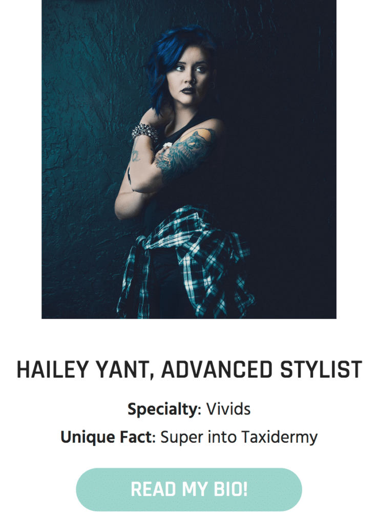
Subtle copywriting in the Bios summary page reflect the “we’re awesome but don’t take ourselves too seriously” attitudes with a fun, unique fact about each stylist.
Even the Reviews
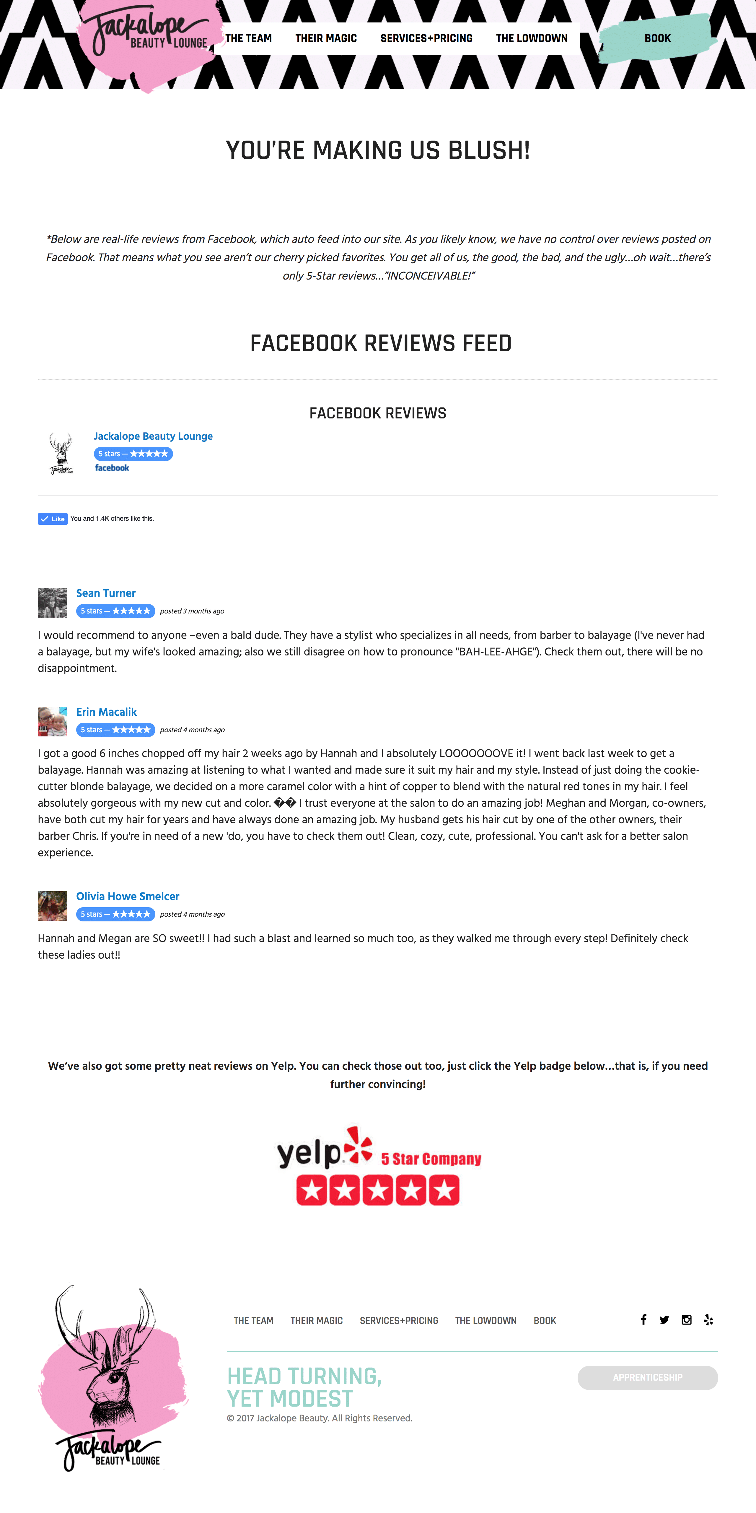
The ownership wanted unfiltered reviews to populate their site. This would reinforce their value of transparency. We made them aware of the benefits and risks, they considered, and said, “Let’s do it.” They had confidence based upon their past reviews. We created a fetch that pulls their latest review regardless of stars. A 1-Star rating can appear on this page just as easily as a 5-star review can.
DESIGN ELEMENTS
The General Look
One of the best elements was that their logo mark is so quirky – the legendary mythical Jackalope. This logo allowed the site to carry forth the same quirkiness without feeling disjointed.
Illusion Pink and Sinbad were used as the base colors for the design.
Photography
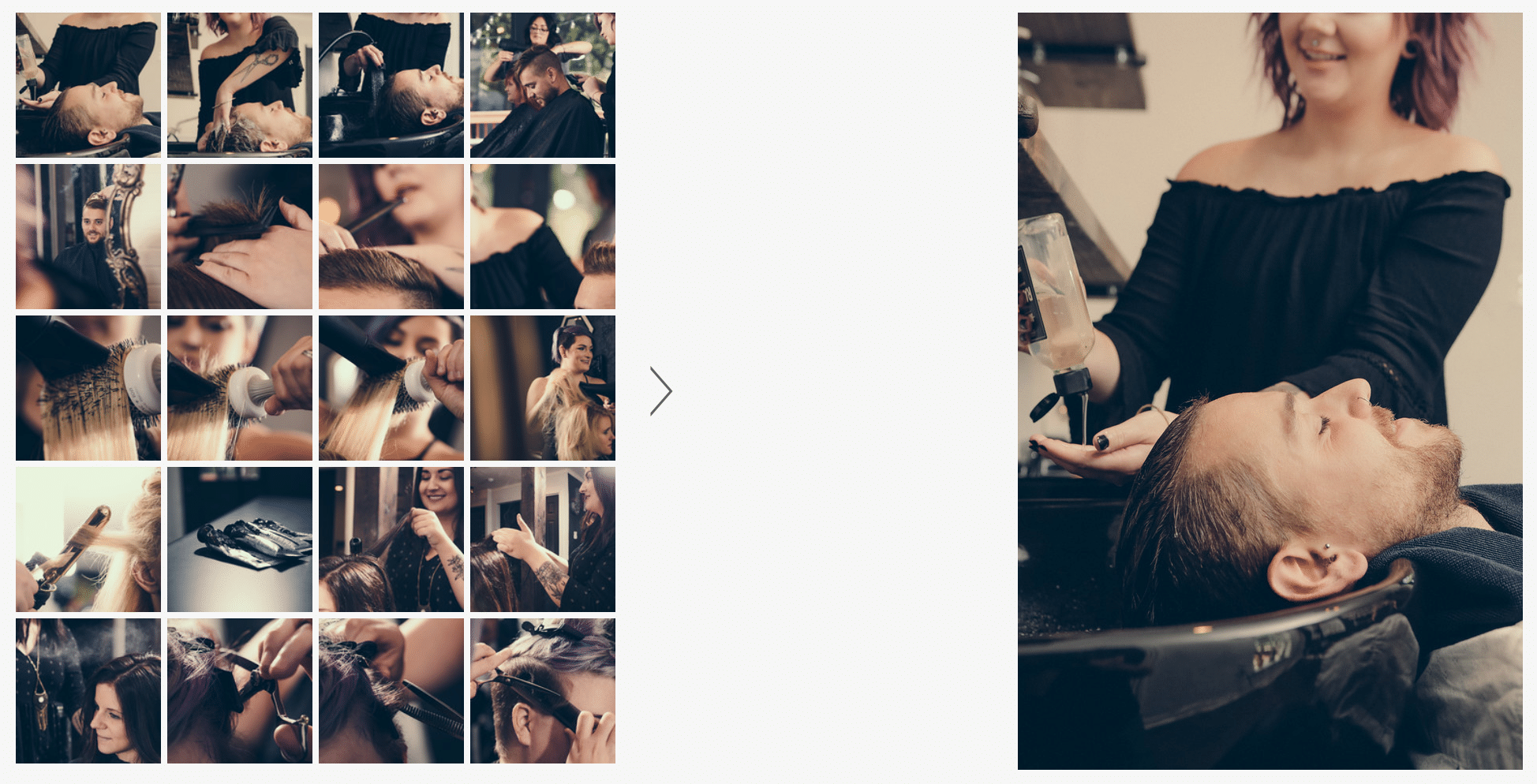
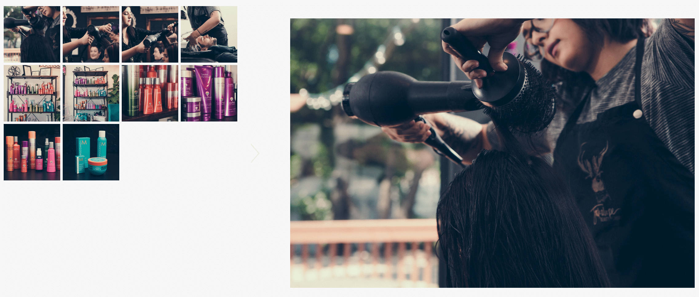
No stock photography was used on the site. Keeping with the authenticity mantra, Jackalope chose to take the extra step of having a day-long photo shoot with Scott Cornelius to capture stylists pics, client shots and inside the studio environmental shots. We provided the desired shot list and orientation list to assist the photographer. We also consulted with him on color tones, lighting and photoshop treatments.
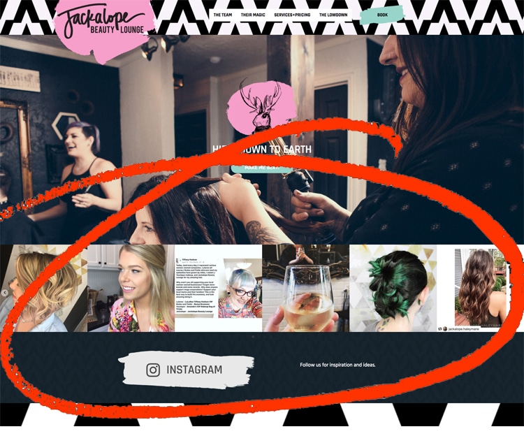
Use of Instagram Feed on Homepage
Jackalope has a large Instagram following, and they are active on the platform. We chose to integrate a feed into the front page of their website. We realize it is a looser look than many corporate businesses would choose, but for Jackalope it fits perfectly. It screams of the authenticity and unfiltered nature of the brand.
Gallery Page
We built a massive gallery page into the site. When selecting a salon, site visitors want to see what the stylists are capable of and to imagine how they can look as a result. A massive diversity of styles and cuts are available at Jackalope. We made the gallery sortable by stylist.
Social Media
As would be expected of a trendy salon, the Jackalope crew does a fantastic job at social media. From Twitter to Facebook, Instagram to Yelp, the website makes all these platforms easily accessible to visitors.
Balayage.
|| stylist @jackalope.cass || #jackalopebeautylounge https://t.co/kKGBAK4Cx3 pic.twitter.com/hfubpLc1sA
— JackalopeBeauty (@JackalopeBeauty) August 8, 2018
https://platform.twitter.com/widgets.js
Booking
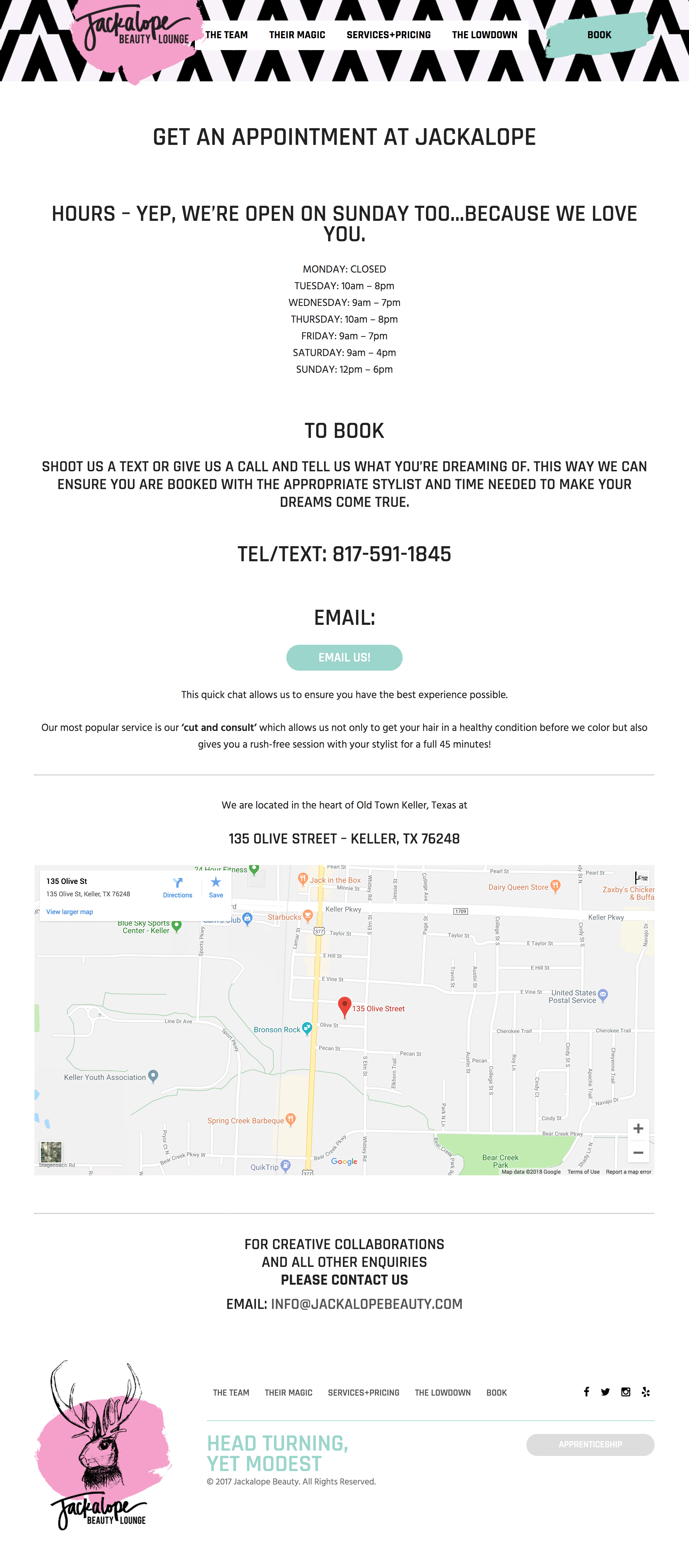
The Jackalope team debated whether to take online, automated bookings. Because they value relationships and connection, they decided they want to speak directly with a potential client to assess their needs and make sure they are matched with the best stylist for their need.
The Results
Jackalope Beauty Lounge stylists are consistently booked, and the Lounge is expanding. Their website is helping them accomplish their goals.
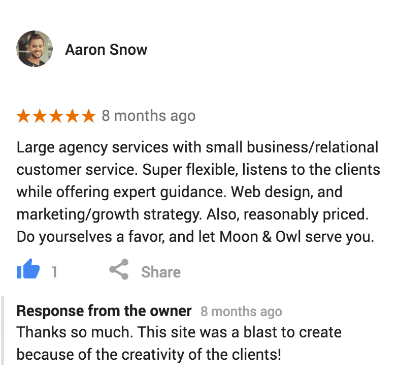
The folks at Jackalope are happy with their site…https://goo.gl/maps/SJCL8Cs8Kdy
View the live site at http://jackalopebeauty.com/.
The following blog post Jackalope Beauty Lounge Keller, TX Web Design Dissection was first published to: http://moonandowl.com




No comments:
Post a Comment