5 Most Important Landing Page A/B Tests to Optimize Your Facebook Ad Campaigns written by Guest Post read more at Duct Tape Marketing
What if you have impressions and clicks on your Facebook ad campaigns but no conversions? This is where most marketers get stuck. You are showing the ads to the right audience, getting a good amount of engagement yet at the end of the funnel, users are dropping off. People are not getting convinced where they land. The culprit?
The Landing page.
The solution? A/B test your landing page to find the biggest issue that is causing the user to go away. In this post, we’ll take 5 examples of different types of Facebook ad campaigns and solve the issue of conversion.
Let’s discuss some of the likely reasons why your Facebook ad campaign is failing and what changes you can do on your landing page to avoid that from happening:
A/B test
A/B Testing is a marketing strategy in which two versions, A and B (the control and the treatment) are tested against each other. The goal is to identify changes that increase the chance of conversion.
Now, there can be numerous A/B tests that can help in optimizing your Facebook ad campaigns but let’s start with the most obvious ones.
1. Call-to-Action
The impact of your call-to-action depends on two things: the placement and the text on it.
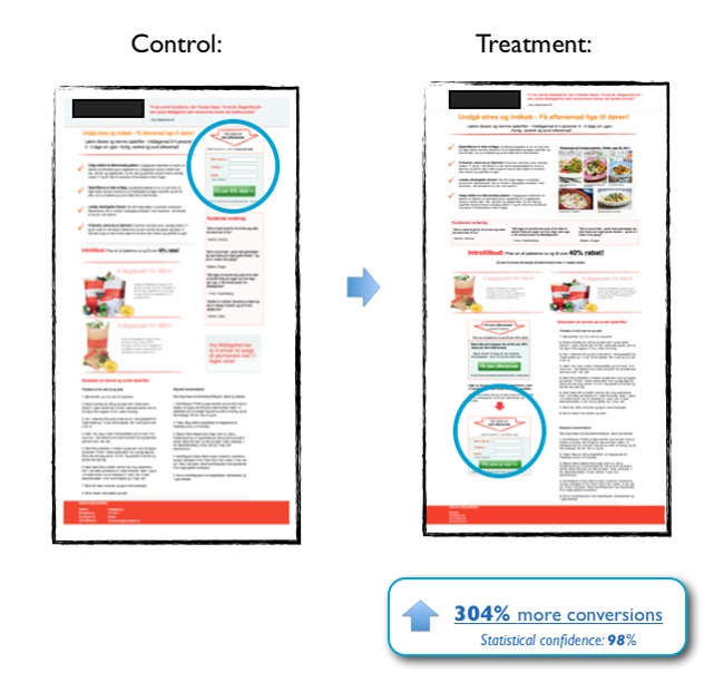
Putting your call-to-action above the fold is not always the answer. It depends on the product or service that you are offering. For example, for an eCommerce website, it is advisable to put the CTA right in front of the visitor, whereas for more complex products like SaaS etc the CTA should come once the user has been educated about the offering. Michael Aagaard of Content Verve got 304% increase in conversions by moving the page’s CTA below the fold.

The second most important factor of the CTA is the phrase. A convincing CTA can go a long way in conversions to happen.

As you can see, using “Get” in the call-to-action increased conversion rates by 14.79%. even though both calls-to-action provide the same offer.
2. Message mismatch
The best online ad campaigns consist of key features or variables to provide viewers with a seamless, coherent experience from end to end. What if the users are not getting what they expected from the ad they saw? Low conversion!
Message match means the keyphrase you’re targeting should also show up in the headline of your ad and on the headline of your landing page too.
Here is an example from Oliver Wicks, let’s say you see an ad that looks like:

When you click on the ad, you get this on the landing page:

The landing page is in coherence with the ad copy shown. If your landing page is showing completely different message your ads are bound to convert less.
3. Test your landing page copy
Passive voice has a weak quality and can be boring. Active language excites, energizes and drives action.
The company L’Axelle, which sells underarm sweat pads, ran an A/B test on the product landing page. Their original page used a passive headline. The second used direct language and strong verb.
Version A

Version B

This change in copy led to a 93% increase in clicks and a conversion rate of 38.3%. This implies that active voice can cause users to take action more promptly.
4. Form fields
A large form can scare away even the most interested person. Don’t ask questions that the user needs to think before answering. Asking a person for their first name is one thing, but asking for their credit card details is another.
So what is the right number for form field entries?
Just don’t add anything that doesn’t NEED to be there. Make sure every form field is 100% necessary before you add it. For example, unless you’re going to use it in an email, you don’t need to ask for a person’s last name.
Here is an example of a great form. H.BLOOM’s landing page has some great conversions elements: an above-the-fold form, just the required number of fields and the bright orange “Submit” button.

5. Testimonials and social proof to add credibility
Add testimonials, media coverage, and a few social media mentions to give your brand reputation and credibility. Studies show that reviews are 12-times more trusted than product descriptions and sales copy. When users land on a page that has testimonials or social proof, they tend to trust the brand more and their chances of converting become higher. Add social sharing buttons and use exact numbers and data in your testimonials if you can. Here is an example of Robbie Richards’ blog.

Conclusion:
There can be so many things to test on your landing page when your ads are not working but starting off with the most important ones can definitely fetch you results. We can try and implement what worked for others and achieve results but at the end of the day, we have to find what will work for us.
About The Author
 Thomas Kriebernegg can look back on over 10 years of experience in Online Marketing and 5 years in App Marketing. He is an app enthusiast and the CEO at App Radar, an online App Store Optimization Tool that helps app developers understand and optimize their app store appearance.
from Duct Tape Marketing https://www.ducttapemarketing.com/landing-page-tests/
via IFTTT
No comments:
Post a Comment